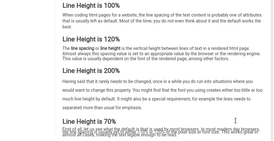
When coding html pages for a website, the line spacing of the text content is probably one of attributes that is usually left as default. Most of the time, you do not even think about it and the default works the best in most browsers.
The line spacing or line height is the vertical height between lines of text in a rendered html page. Almost always this spacing value is set to an appropriate value by the browser or the rendering engine. This value is usually dependent on the font of the rendered page, resolution of the page and several other factors.
Having said that it rarely needs to be changed, once in a while you do run into situations where you would want to change this property. You might find that the font you are using creates either too little or too much line height by default. It might also be a special requirement, for example the lines needs to separated more than usual for emphasis.
First of all, let us see what the default is that is used by most browsers. In most modern day browsers, the line spacing is usually set to either 110% or 120% of the pixel size or font size. This works great in almost all cases, making the text legible enough to be read.
In order to modify the line spacing, you will typically use the cascading style sheet (css). The CSS property that handles this is named line-height and can be used with most HTML tags that surrounds the text on the webpage.
You can specify the value for line-height just as you would specify any other size in CSS, either as a number, pixel size or as a percentage. Just as any other style you can specify them at any tag level, using any of the css techniques. You can inline it as well, if needed. In this post, we will use the style attribute of the p tag as examples, but you can use it in other tags as well such as body, span or div.
Using Relative Numbers
When you specify the values as a number, it is based of the current font size as the base. The current font size is multiplied by the number that you specify to calculate the line height or space between lines.
<p style="line-height:1.4">
Paragraph content here
</p>
You can also use other methods for specify the values, such as em, rem, pt etc. As an example, let’s see how to use px or pixel size.
Using Percentages
When you use percentages, it works similar to using the relative numbers. It is based of the current font size of the element. The percentage is actually a different way of specifying the relative size equivalent to the relative number.
<p style="line-height:134%">
Paragraph content here now has a spacing equivalent to 1.34
</p>
If you want to reduce the height, then you would use a value that is less than 100% (or less than 1 in the relative number method). An example would be
<p style="line-height:85%">
Paragraph content here has a spacing equivalent to 0.85.
</p>
Using em unit
Another unit you can use is the em unit. Here the size is calculated relative to the font size of the element.
<p style="line-height:2em">
paragraph content here will have spacing twice that of the element's font size.
</p>
Using rem unit
Another relative unit that you can use is the rem, which is similar to em unit in the above example, but the value is computed based on the font size of the root element, not the size of the current element. This can be pretty handy to deal with nested tags that modify the font sizes.
<p style="line-height:3rem">
The paragraph content is spaced three times the size of the root font size.
</p>
Using pixel size
You can also specify the line height using the pixel size. This makes the spacing independent of the font that is being used, which may not always be a great idea.
<p style="line-height:16px">
Paragraph content here
</p>
As you would expect, negative values are not allowed in the line-height property. As a rule of thumb, always try to use either of the unit less values (percentage or number). This gives it some flexibility when it comes to different fonts that might be used. This also works well with different resolutions of the devices where your webpage might be viewed.
Although I have used the inline style as example, you can very well use the same syntax in the CSS (cascading style sheets) files or any place you defined styles.
As I mentioned, the default works the best in most cases. Make sure to test your webpage rendering in as many devices and browsers as possible.